Get in touch
|
|
Member First is The Next Generation Credit Union.
Their challenge was to transform their website and match the online technical capability of banks with an end-to-end “member-first” digital experience that would engage users, address their financial needs and strengthen MFCU’s position in the market and local community.
To do this, we had to combine the traditional offering of a credit union with the latest online tools and banking facilities to allow members to manage their finances on the move seamlessly and intuitively.


Competing against financial services giants like Revolut or AIB meant that we had to take big steps to deliver the ultimate member experience. To do this, we had to see things from their perspective and remove blockers that prevented them from embarking on their financial journey.
So we profiled personas, detailed their pain points and motivation for visiting the site, looking at new and existing features to deliver a positive and relevant user experience.
Our design principles led to seamless user journeys and a modern User Interface with space for content to breathe, colour to increase brand recognition and trigger action in order to support our primary goals to increase memberships and grow MFCU’s loan book.
Our focus was on removing complexity and simplifying user journeys so we fought hard to reduce content and present key information only where relevant to increase user engagement and goal achievement.
We integrated the site with Visualyse, an end to end online loan system that enables faster loan approvals thanks to an automated decision matrix that allows lenders to rapidly evaluate eligibility criteria. A major step forward for MFCU who can now compete with new digital entrants on functionality and experience.
We integrated the site with Microsoft Dynamics CRM to track lead sources and eliminate the need for manual form processing. This allows MFCU to gather customer data & insights to optimise their experience, making them feel understood and supported on their financial journey.
We evolved the Chatbot so that it can now handle increasingly complex queries. The enhnaced chatbot acts as s a lead generation and customer service tool, reducing branch visits and calls for queries that can be easily handled online, allowing MFCU to reallocate thier resources to higher value activities.
Finally, we also integrated the site with Calendly to allow members to book online appointments through the website, which is currently being piloted in one branch. People can see available slots, make and cancel appointments without the need to make a call, saving time and money for all involved.
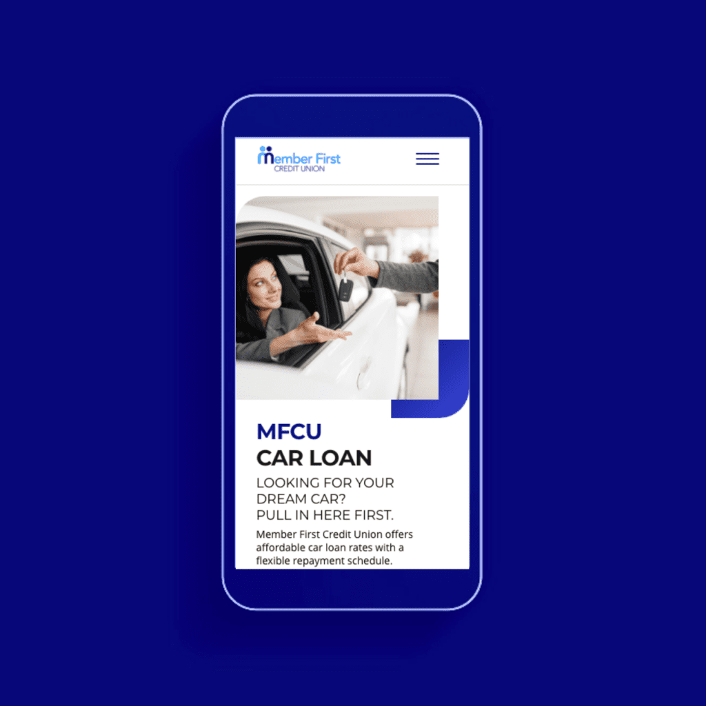
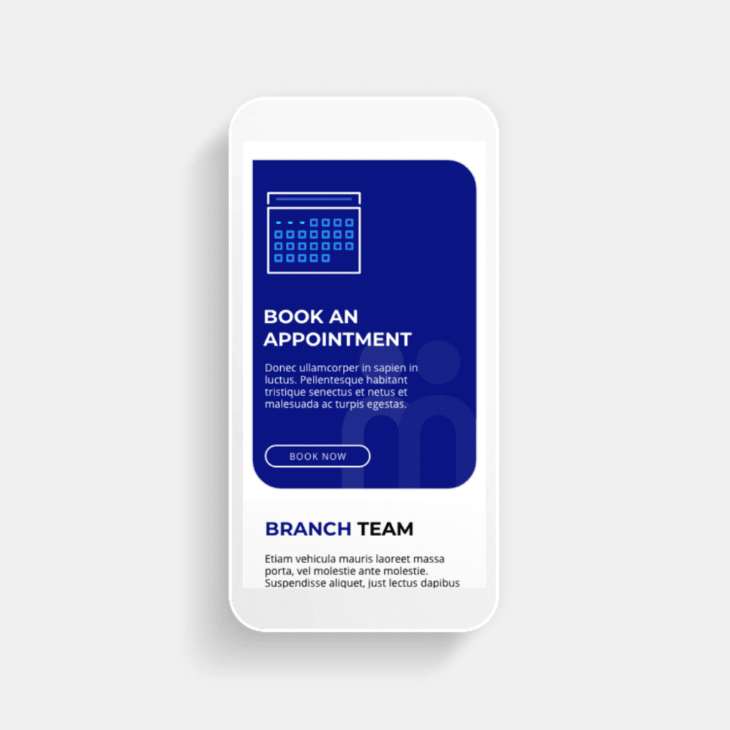
We implemented the new brand identity to ensure MFCU would look and feel different, while remaining truthful and authentic to their core community values.


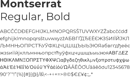

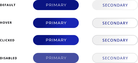


The new site provides a seamless and intuitive user experience with simplified online tools that allow members to process complex data. Members can transfer money and apply for loans online, via email, a mobile app or over the phone so they can bank on the go, or from the comfort of their home.
Key results include:
Take a look at https://www.mfcu.ie/
|
|
|
|
|
|
|
|
|
|
|
|